Refugee Youth Service support unaccompanied children and young people on the move.
Areas of work logo / campaign / digital
Industry not-for-profit
E-Commerce website refugeeyouthservice.org
Refugee Youth Service support unaccompanied children and young people on the move.
01.
Branding
Refugee Youth Service commissioned Me & You Create to complete a total refresh of their existing branding – from logo through to website redevelopment.
The rebrand needed to be bright, positive and playful to reflect RYS’s work with young people. However, it also had to be professional and powerful so as not to undermine the importance of their influential, life-saving work. Therefore our careful approach ensured that the brand will appeal to a broad range of audiences, whilst remaining consistently and recognisably ‘Refugee Youth Service’.
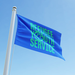
The new Refugee Youth Service logo projects the idea of displaced young people on the move, through the introduction of a globe-like symbol and a contemporary, playful font. The letter ‘O’ has been enlarged, and wiggly lines introduced, to depict both the routes taken by people on the move and the rough outlines of Europe, Africa and The Americas.
The condensed font allows the primary logo to stack into a neat and sturdy block. The strength of this shape conveys a sense of the resilience and unwavering support of the organisation. The secondary logo sits in one long line – really emphasising the O-shaped symbol.
02.
Promotion
Brand flexibility is central to the Refugee Youth Service redevelopment. Their promotions need to attract a broad range of stakeholders from professionals working with unaccompanied minors through to other NGOs, funders, and the displaced young people themselves. Each audience needs to be targeted with focused messaging, and are likely to be drawn-in by different design styles.
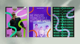
This lead us to develop a range of promotions to appeal to each of their stakeholders – from the colourful and playful styles of those used encourage displaced young people to join their support networks, through to more corporate layouts to entice serious funders.
The wiggly lines that feature in the logo have been extended and then re-introduced into Refugee Youth Service promotions – cutting through the designs, dividing up content and bringing a sense of creativity and movement to static designs. These lines are central to the brand because they represent the movement of displaced young people around the globe; as well as the arts and crafts, and sports programs that the children attend as part of RYS’s support network.
We selected ‘Bebas Neue Pro’ as the brand font thanks to its variety of widths and weights that offer a great deal of flexibility – again helping the RYS team to tailor their promotions to specific stakeholders. A colourful palette has been introduced which retains the recognisable blue and black shades from their previous branding, but now includes eight bright secondary shades to bring flexibility to the brand.
The website was built in the Wordpress CMS using a no-code, drag-and-drop system. The website incorporates all the new brand elements to create a unique, bright and animated e-commerce website for Refugee Youth Service.
Visitors can book and pay for training via the online store using a secure payment portal which is integrated into the website. The website and store are now managed and updated internally by the Refugee Youth Service team using our recorded training session as a reference.
03.
The Result
3x
Sit enim quia ab reiciendis doloremque vel nisi neque vel molestiae quidem. Est cumque deleniti et sint ipsum eos consequatur omnis quo maiores molestiae rem vitae venia. Sit enim quia ab reiciendis doloremque vel nisi neque vel molestiae quidem. Est cumque deleniti et sint ipsum eos consequatur omnis quo maiores molestiae rem vitae venia. Sit enim quia ab reiciendis doloremque vel nisi neque vel molestiae quidem. Est cumque deleniti et sint ipsum eos consequatur omnis quo maiores molestiae rem vitae venia.


